
If you've read a few of my blog posts you know that after writing the research paper Quantitative Value Investing in Europe: What works for achieving alpha, I have become a big supporter of using stock price momentum as one of the factors you should look for when looking for investment ideas.
It's simple
The idea behind momentum is simple, once a share price starts moving up or down (numerous research studies have shown) it will continue in that direction.
Your inside source of information
But do you have a good source of information that tells you what markets are moving up or down or have recently changed direction?
If not here is something that helps you do exactly that:
- An ETF Momentum Dashboard (43 indicators) and a
- World Exchange Momentum Dashboard (42 indicators)
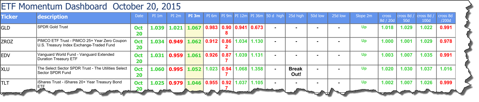
ETF Momentum Dashboard
The ETF Momentum dashboard shows you the price movements of industry sectors using 43 world-wide Exchange Traded Funds (ETF’s).
This gives you an unique insight as to what industries have been moving up and down over the short (from 1 month) to medium (36 months) term.
You can also see four moving average direction indicators from 20 to 200 days.
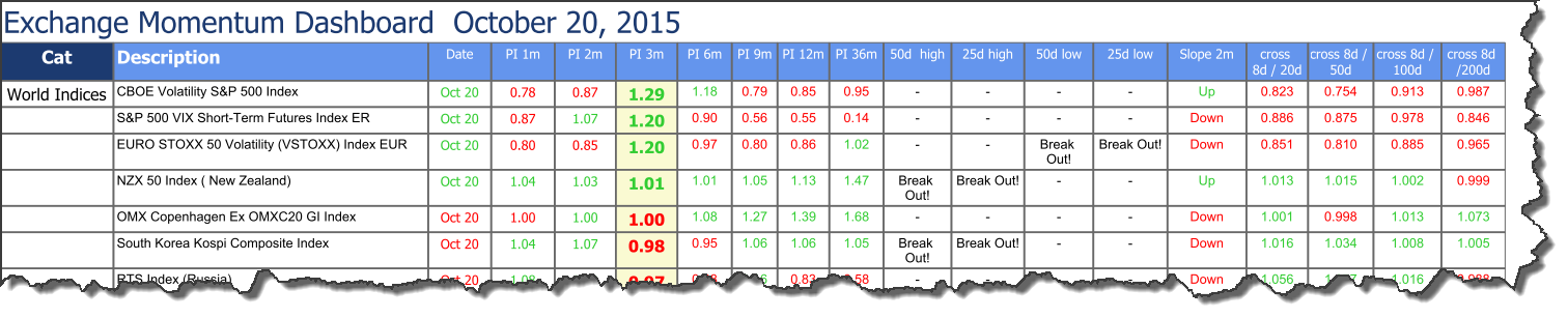
World Exchange Momentum Dashboard
The World Exchange Momentum dashboard shows you the price movements of 42 world stock market indices.
This tells you exactly what stock markets and indices world-wide have moved up and down over the short (from 1 month) to medium (36 months) term.
You can also see the market directions with four moving average indicators from 20 to 200 days.
Not just for traders – also long term investors
If you are a trader – this is valuable information as you can see what is moving up, down or changing direction so you can quickly change your investments.
As a long term investor you may be thinking – this is nothing for me. But, you may want to reconsider.
Because the dashboards show you information up to 36 months they can help you see what markets have declined the most so you know exactly where to start looking for undervalued companies.
Where can you find it?
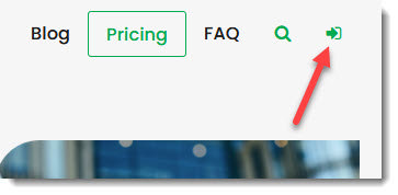
You can find the dashboards by first logging in.
Then below the heading Market Dashboard click on Go to Market Dashboard.
To view the two dashboards simply click on the file names as shown below.
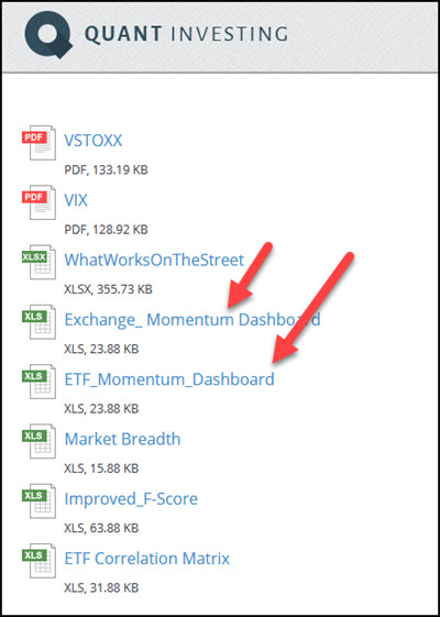
The ETF Momentum Dashboard
This is what the ETF Momentum Dashboard looks like:
Click image to enlarge
The World Exchange Momentum Dashboard
And this is what the World Exchange Momentum Dashboard looks like:
 Click image to enlarge
How to use the dashboards
For traders
If momentum changes (either up or down) you will see it first in very short term momentum (PI 1 month), and if the trend continues you will see it confirmed by the two month (PI 2 months) and three month momentum (PI 3-6 month).
Watch short term momentum carefully as it is known to change direction quickly and it is not uncommon to see several months of momentum reversed in a short period of time.
Long term investors
Value investors can look at the 36 month price trend (PI 36m) to see what markets have declined the most where you will most likely be able to find undervalued companies.
Scroll down for all definitions
To see a full description of all the indicators used in the dashboards scroll down the page.
Check back often
The dashboards are updated every Monday so be sure to add the page to your browser favourites so you can find it easily.
PS If you want to get access to the dashboards right now sign up here.
PPS You get access to the dashboards with all of your subscriptions - sign up now