We improved the company dashboard so you can easily compare the company you are analysing to other companies:
- Worldwide
- in the same Country
- the same main industry sector worldwide
This is what it looks like:
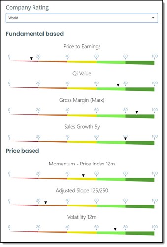
As you can see each indicator has its own gauge where the companies rank, against the group, is shown with a small black triangle.
You can easily see how a company compares to its peers based on four fundamental and three price based indicators.
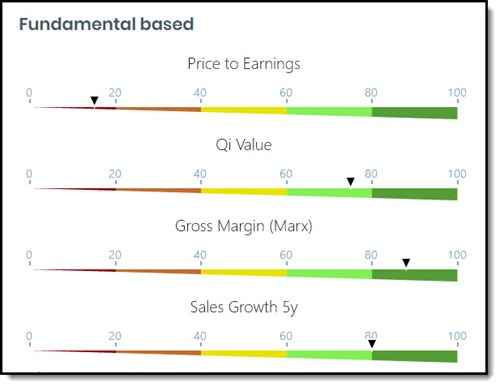
Four fundamental gauges
The four fundamental based indicators are:
- Price to Earnings
- Qi Value Ranking
- Gross Margin (Marx)
- Sales Growth 5 years
This is what they look like:
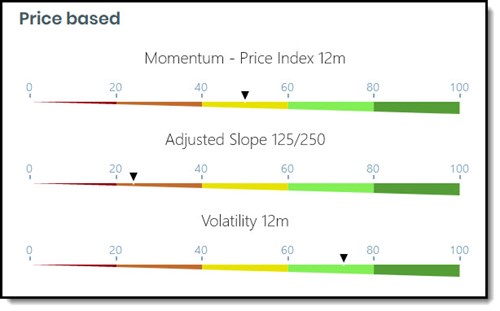
Three price based gauges
The three price based indicators are:
- Price Index 12m
- Adjusted Slope 125/250
- Volatility 12m
The three price based gauges are:
How a company compares
How the company compares to the group is shown with a small black triangle - see image below.
All companies are ranked based on its values as a percentage of the companies in the comparison group.
The gauge thus shows you in what percentile the company is, compared to all the comparison companies.
Dark red means bad or expensive
Dark Red – if the company’s value (small black triangle) is in the dark red part of the gauge it means the company is in the 20% of companies that either rank badly or is expensive in terms of that ratio.
Price to Earnings example , if the company ranksdark red in terms of Price to Earnings it meantit is expensive and currently has a Price to Earnings ratio in the highest 20% of the companies it's compared to.
Gross Margin (Marx) example , if the company ranks dark red in terms of Gross Margin (Marx) it meant it currently has a low Gross Margin (Marx) ratio in the lowest 20% of the companies it's compared to. (Reminder: Gross Margin (Marx) = Gross Profits / Total Assets thus the higher the ratio the better)
Price Index 12m , if the company ranksdark red in terms of Price Index 12m it meant it has weak stock price momentum, in other words its 12m price movement is low, or in the lowest 20% of the companies it's compared to.
Dark green means good or undervalued
Dark Green – if the company’s value (small black triangle) is in the dark green part of the gauge it means the company is in the 20% of companies that either rank good or is undervalued in terms of that ratio.
Sales Growth 5y example , if the company ranksdark green in terms of Sales Growth 5y it meant it has high sales growth, in the highest 20% of the companies it's compared to.
Adjusted Slope 125/250 example , if the company ranksdark green in terms of Adjusted Slope125/250 it meant it has good or positive momentum, in the highest 20% of the companies it's compared to.
Volatility 12m example, if the company ranksdark green in terms of Volatility 12m it meant it has low volatility, in the lowest 20% of the companies it's compared to.
Not a subscriber yet? Click here to start using these gauges to improve your company research NOW!