We wanted to add this feature a long time ago, but we didn't have the data.
But since 4 December 2015 we have built up a historical database to have enough data to add long term historical ratios to the Company Dashboard page.
7.5 years of data available
As of today, we've built up a database of 7.5 years of historical data on all the ratios and indicators in the screener.
This means you can now see exactly how a company was valued over the past seven years to see if it's cheap or expensive compared to the past.
Ideal for reversion to the mean investing
This is a great help if you are a reversion to the mean investor.
Reversion to the mean is a strategy where investors bet that the valuation of a company will return to its mean or avarage. If it's expensive the company stock will fall, and its valuation will return to the mean or if a company is cheap its stock price my increase returning its valuation to the mean.
Helps you identify value traps
It also helps you avoid value traps. For example if the valuation of a company has remained the same it is unlikely to increase in future thus making it a company you should avoid.
Easily compare the valuation of companies over time
You can also use this historical valuation ratios to easily compare the valuation of companies over time.
For example, how has the valuation of Apple Inc. compared to that of Meta Platforms Inc. (formerly Facebook) over the past seven years.
Historical valuations are available for
Historical valuations are available for the following ratios:
- Price to Book
- Price to Earnings
- EBITDA Yield
- Earnings Yield
- Free Cash Flow Yield
- Shareholder Yield
- Dividend Yield
- Qi Value
- Value Comp Two
- MF Rank (Magic Formula)
Where to find historical ratios
Historical valuation ratios are easy to find and use.
Simply hold your mouse over the historical icon and the chart will appear – this is what it looks like:
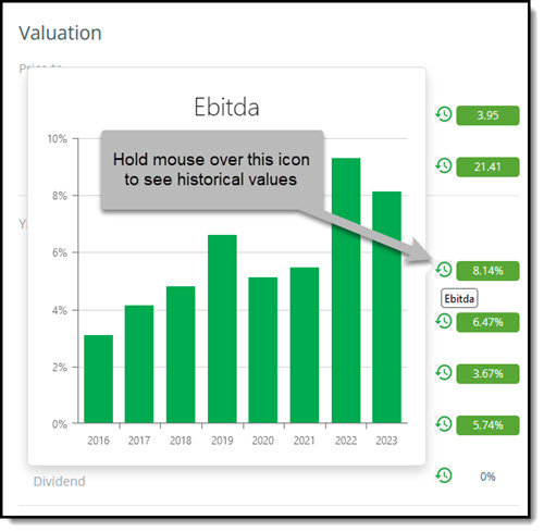
Historical EBITDA Yield
What the bar chart shows you
What the bar chart shows you is the value of the ratio over the past seven years.
The bar on the right (2023 in this case) shows you the current value. In this case 6 March 2023.
Each bar to the left shows you the value one year ago. So, 2022 shows you the value on 6 March 2022, and so on until seven years are shown.
If one year ago was not a trading day a value one day further back is used a value appears.
How Apple Inc. has developed
As an example, this is how the valuation of Apple Inc. has changed over the past seven years.
Price to Earnings
This is how Apple was valued over the past eight years on a Price to Earnings (PE) basis.
Even though its PE ratio has dropped from over 35 to just over 25 it is still a lot more expensive than in 2019.
Apple Inc. Price to Earnings
Shareholder Yield
A quick reminder. Shareholder Yield is the sum of Apple’s Dividend yield + Percentage of Shares Repurchased.
As you can see its shareholder yield has not been this low over the past eight years, mainly due to lower stock buybacks. .
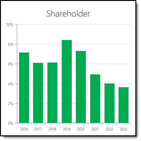
Apple Inc. Shareholder Yield
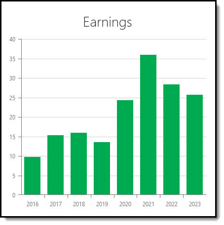
Earnings Yield
Earnings Yield (EBIT to EV) equals Apple’s operating Income or earnings before interest and taxes (EBIT) divided by Enterprise Value.
As you can see also in terms of Earnings Yield Apple is not cheap compared to its past valuation.
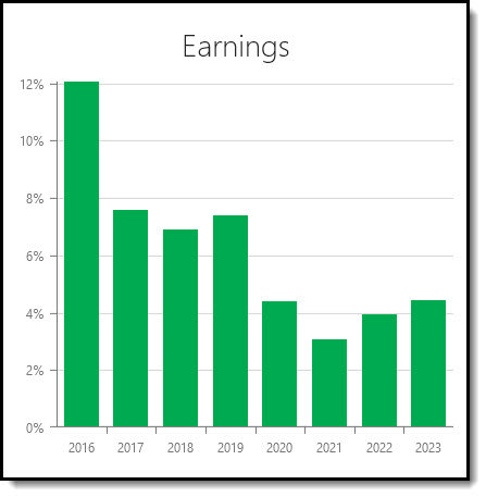
Apple Inc. Earnings Yield
I hope you will find this new feature as helpful as I have.
PS To start using historical valuation ratios in your portfolio now click here.
PPS It is so easy to put things off and forget, why not sign up now before you get distracted?